Finance
Google Sheets Stock Portfolio Tracker
Joshua Gao
21 Dec 2022
When I started investing, I just could not find a free and easy way to track my stock portfolio. So I built one 💪! It features performance benchmarking agains the S&P 500, portoflio overview, and even tracks the trades of the biggest investors in the world. Let me give you a tour!
If you are interested in using this tracker, you can create a duplicate here. If you want to see the code, you can find it in the Google Sheet menu Extensions > App Script.
Trade History
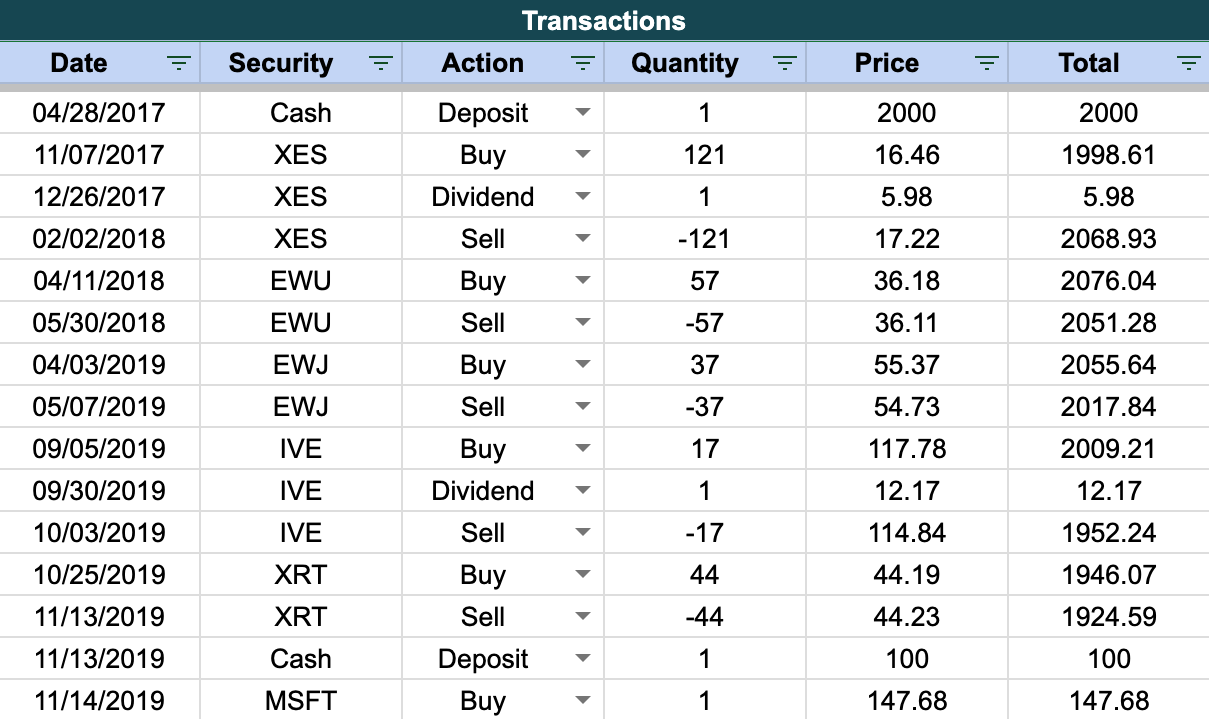
First up, we have a sheet where you can track all your trades. You can enter the date, ticker, type of transaction, number of shares, and price per share. This is the only manual input you need to do! It's important to note that the other sheets render their data through this, so don't mess it up!
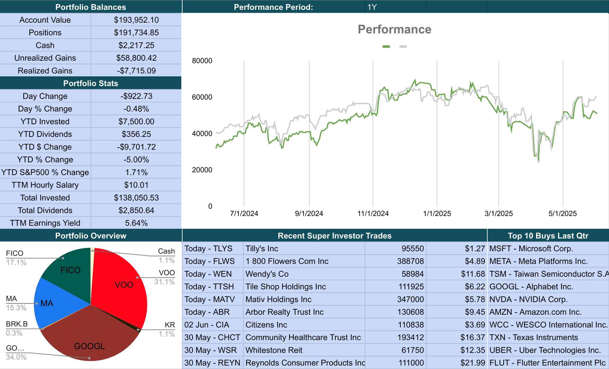
Portfolio Overview
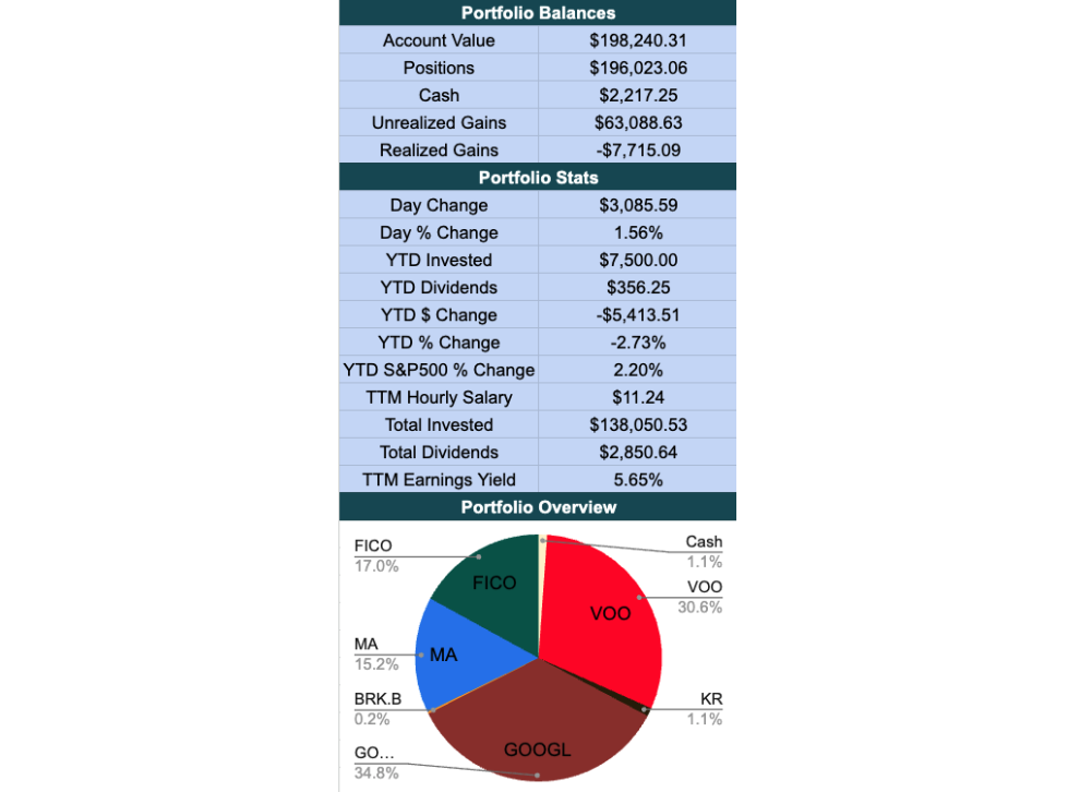
The portfolio overview sheet gives you a quick glance at your performance. It shows your total investment, current value, and profit or loss. You can also see the percentage of your portfolio in each stock, which helps you understand your diversification.
Position Breakdown
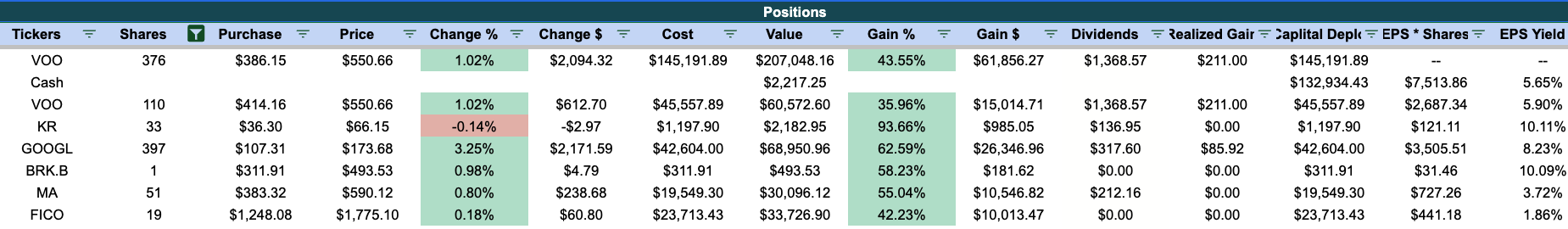
I bet you are wondering: "Wait a minute, how do I know which stock is making me the most money?". Well, this is where I tell you! In the "Positions" sheet, you get a detailed breakdown of your portfolio by each position.
There's some pretty vanilla metrics like percentage gain and position size. But my favorite custom metric is the "EPS Yield" metric. This shows you how much earnings your shares are entitled to, and what the yield is on how much money you paid for those shares. From an owners perspective and heavily simplifying, this is as close as a bond yield as you can get in the world of stocks. (For you finance nerds, I know a better metric would most likely be free cash flow yield.)
This metric encourages me to hold stocks for as long as possible since the EPS yield will only grow larger the longer you hold (as long as EPS grows). For example, at the time of writing, Warren Buffet is yielding 50% on his Coca-Cola stock! Imagine paying $1,000 for a stock, and making $500 every year 😳.
Performance Against S&P500 Tracker
From my very brief search on the internet, this tracking your performance against an index is most likely locked behind subscription pay walls, but I built one here for you completely for free ✨. You're welcome!
The green line is your total gains, while the gray line is how much the S&P500 would have gained if it bought and sold the same amount of money, but into the S&P500. Hopefully your green line is above the gray line!
You can also see this chart in periods of 1 day, 1 month, YTD, 1 year, 5 years, and the lifetime chart.
Follow Super Investor Trades
Have you ever wondered what the biggest investors in the world are buying? Well, I have a section for that too!
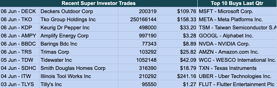
On the left side, this table shows you the most recent trades that the best investors have made. It provides how many shares they bought, and at what price.
On the right side, you can get an overview of how the best investors are moving as a group. It shows you the top 10 buys overall that all super investors made in the quarter.
You might be wondering, how do I get this data? Most data providers would charge an arm and a leg for this information. I simply just found a handy dandy website called Dataroma that keeps track the 13F filings of any investor with at least $100 million in assets. Then I use good old fashion web scraping, which Google Sheets surprisingly kinda supports.
Conclusion
I built this tracker out of pure necessity—and honestly, just for fun. What started as a personal project to manage my own investments turned into a tool I use every day, and now, you can too. Whether you're just starting your investing journey or you're deep into tracking performance and analyzing superinvestor moves, I hope this tracker helps bring clarity, confidence, and maybe even a bit of excitement to your portfolio.
If you have ideas for features or improvements, feel free to reach out! I’m always looking to make it better. Until then, invest wisely and keep that green line above the gray one 📈.